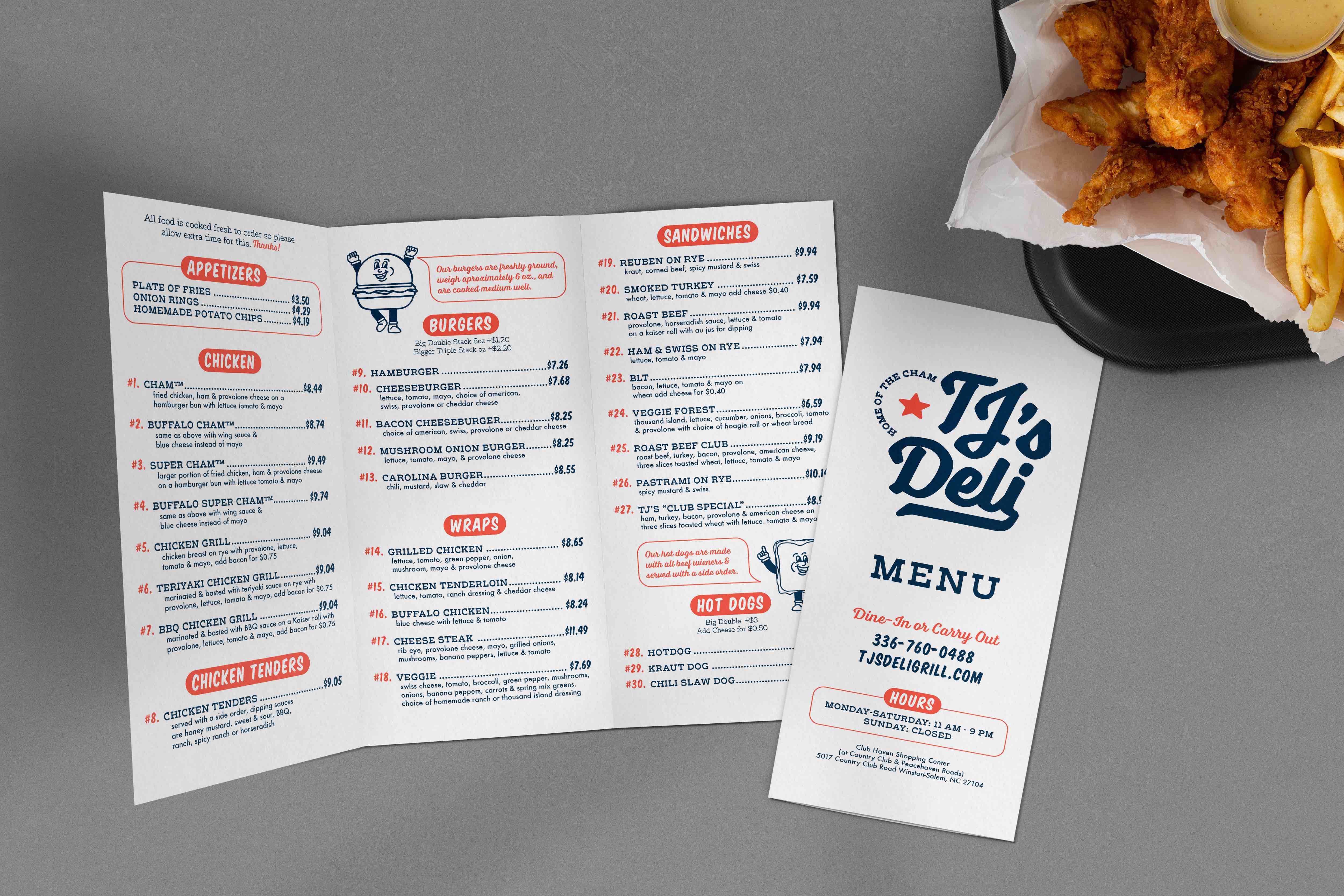
TJ’s Deli and Grill and Homemade Ice Cream has been open since 1982 in the Club Haven Shopping Center of Winston‑Salem, NC. The restaurant largely caters to families and senior adults as well as working professionals looking for a quick and cheap lunch. It offers a variety of American cuisine at an affordable price point. TJ’s also offer homemade ice cream made fresh daily with the best ingredients.
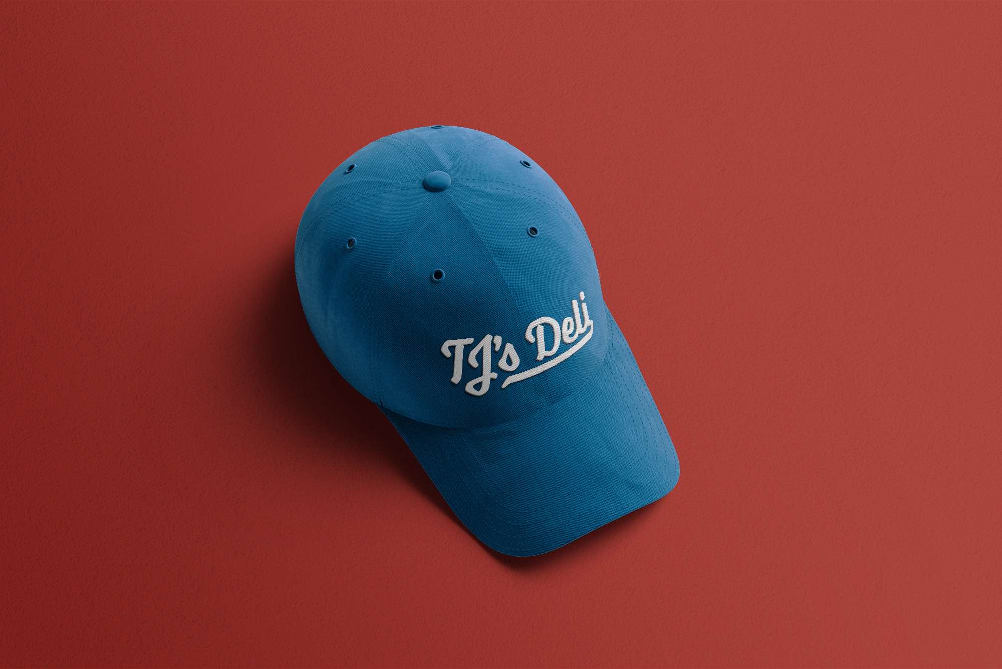
The new logo references vintage Americana through stars and a baseball inspired script. The established typography and color palettes help to reinforce this visual theme. The thicker strokes and soft rounded corners of the logo also reference traditional diner sign painting. Additions of established date and “Home of the Cham” provide a direct insight into TJ’s unique position in the market.

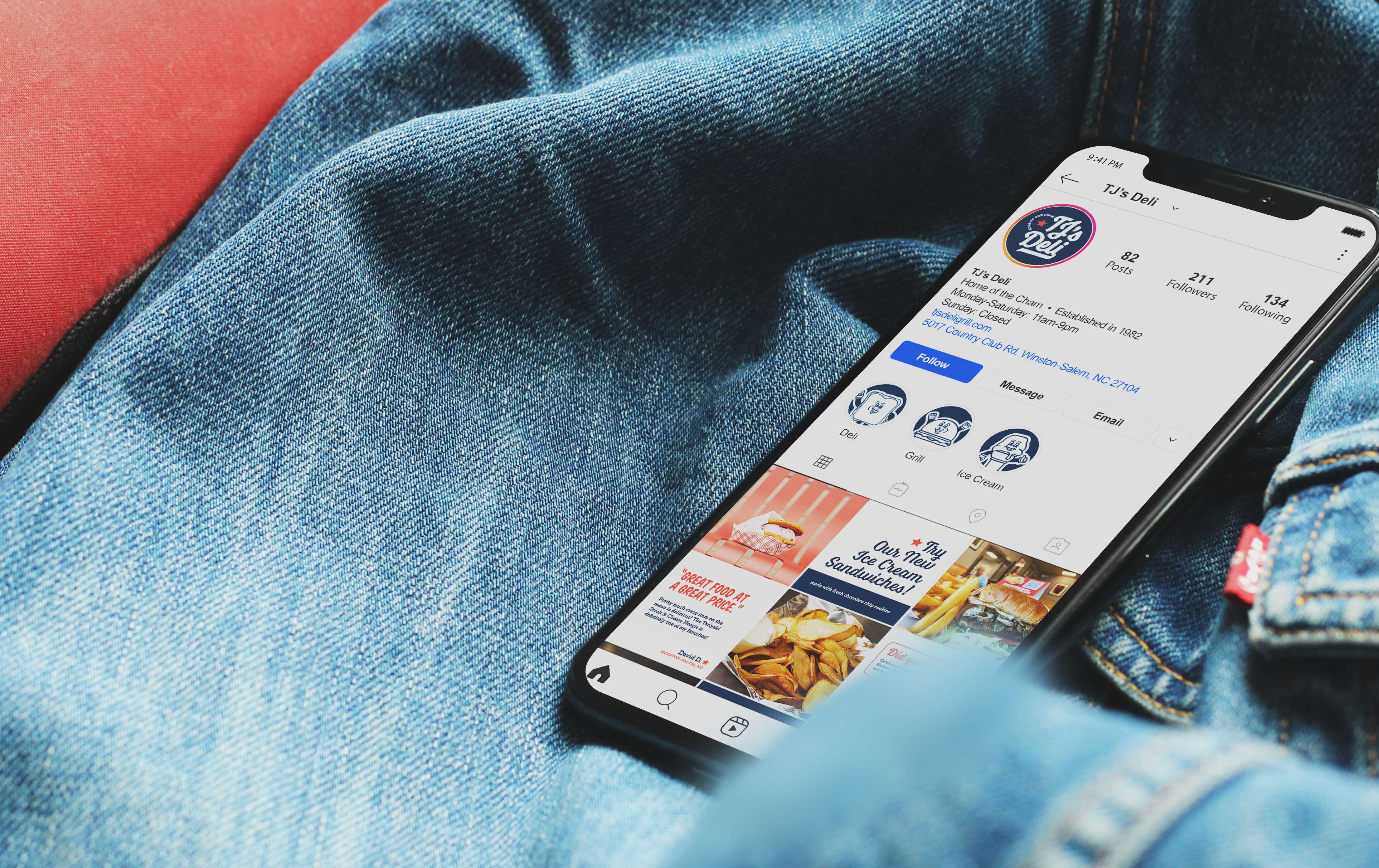
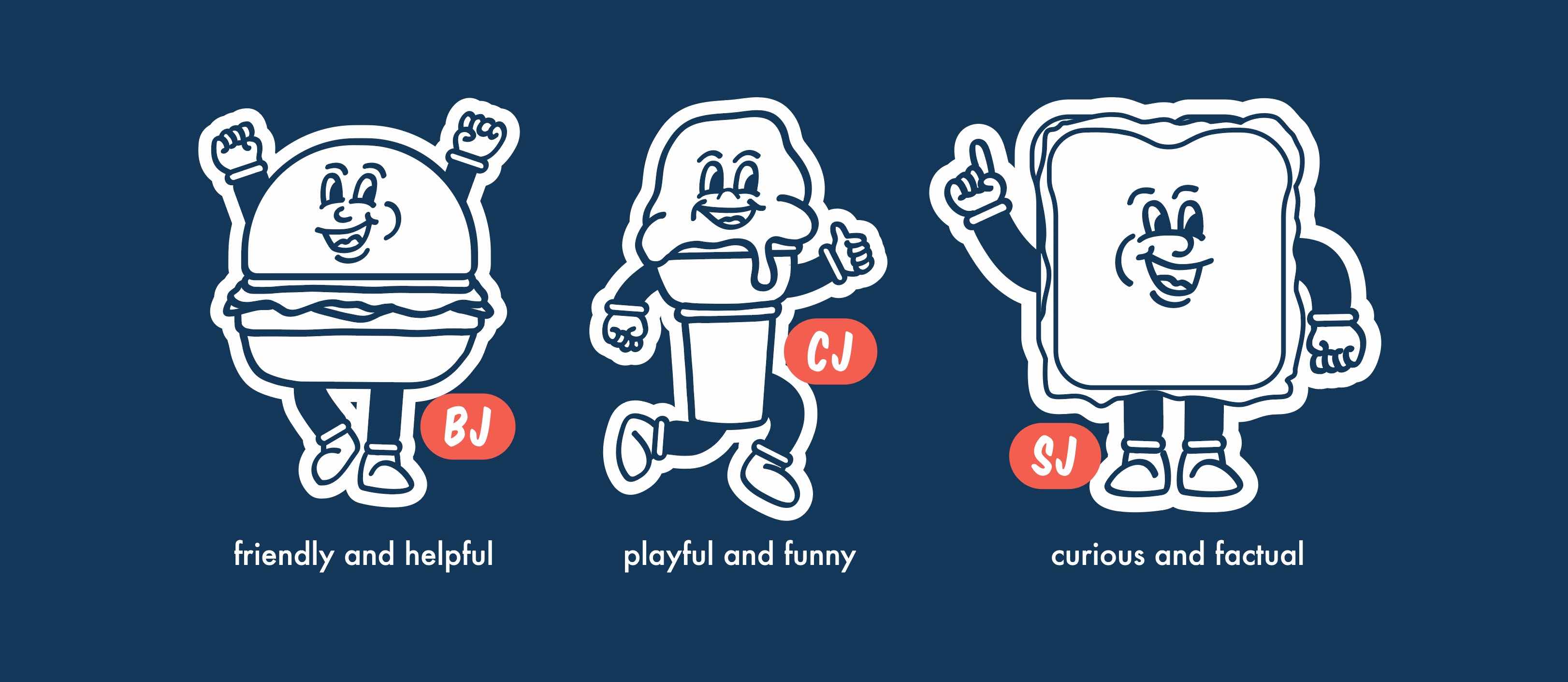
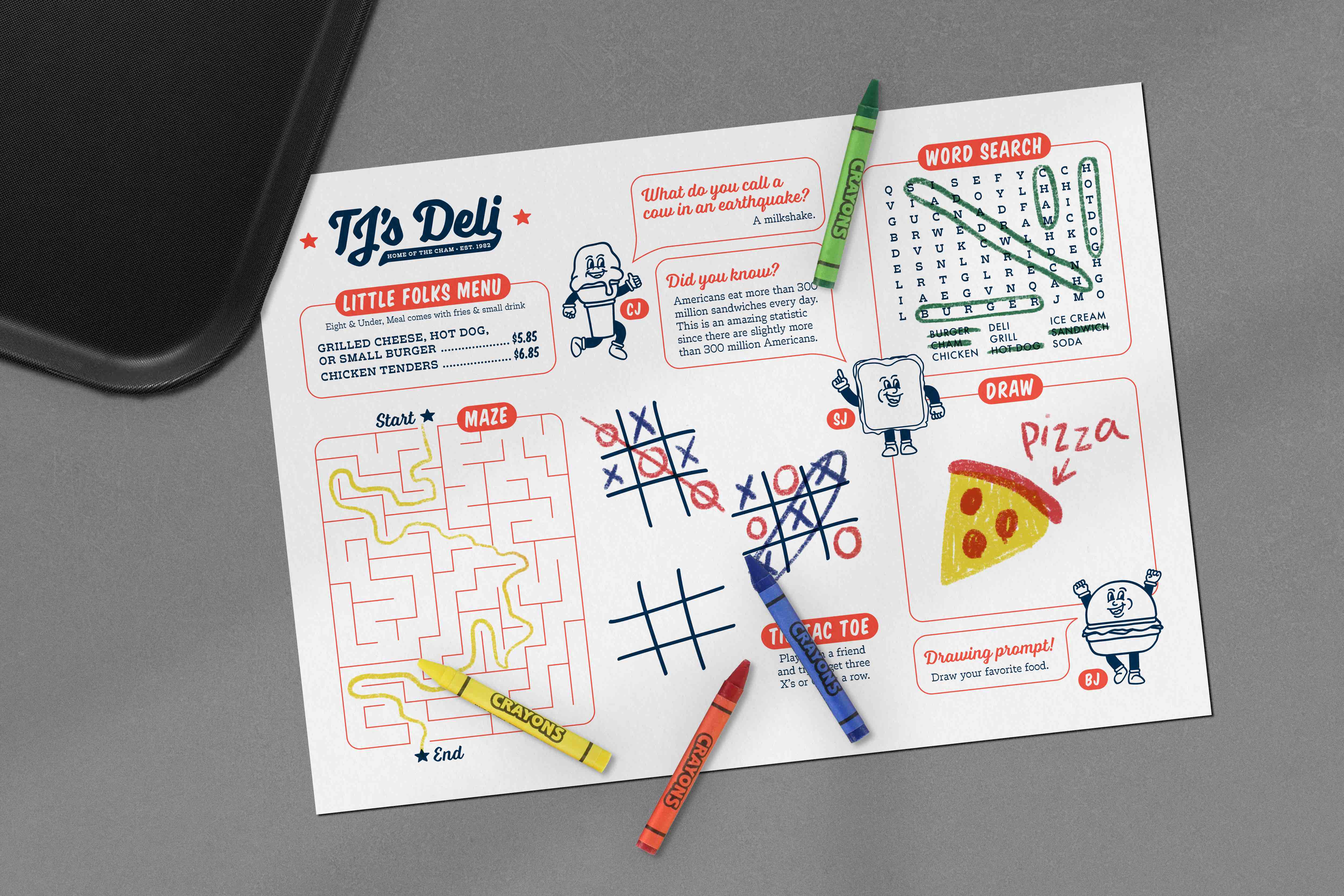
In order to create more cohesion between the different aspects of the restaurant, a set of characters were created. Names were chosen to play on the brand name and each character was given a unique personality to be used within menus and across social media graphics. CJ, represents the ice cream counter and has a more playful and funny nature. BJ represents the grill with a more friendly and helpful attitude while SJ, the sandwich, reflects the deli and possesses a curious and factual personality. On darker backgrounds, the characters are featured with a thick white outline to maintain legibility and approachable personalities.